

Shoot New York City Newsletter
Shoot New York City Newsletter
15 March 2024 - Monochrome vs Color Issue


Issue 199 of the SNYC Newsletter
Greetings everyone! Thank you for all of your well wishes about my cataract surgery. My eye is still healing and adjusting. My vision is clearer and everything appears much brighter. White and blue are the things that I notice the most. I have a few more weeks of eyedrops but so far it has been very good.
I welcome longer daylight hours! More shooting time. And, business is gearing up. It’s funny how people prefer fairer weather for shooting. I’m not a big fan of winter and cold weather. But my love of photography and this city usually overrides that.
Thank you to everyone who has taken my private photo tours and also my group street photography workshops. It is such a pleasure to meet you and I really appreciate your business. Also, a big thank you to everyone who has subscribed to this newsletter. It means a lot to me.
Happy shooting!
The real act of discovery consists not in finding new lands but in seeing with new eyes. Marcel Proust

This newsletter is about my thoughts & experiences on street photography. I hope that you find it of use on your journey. If you are able to, you can support me by buying me a coffee. No sweat if you’re unable to contribute. The newsletter is free for all. Thanks to everyone who has bought me a coffee!!! Maybe one day we’ll be able to have a coffee in person. Mucho love.

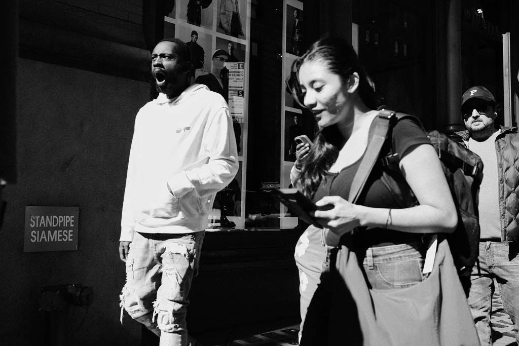
Monochrome vs Color
First things first. I write about my experience and opinions. No, there isn’t an objective answer to whether color or monochrome is better. It’s a matter of personal taste. It is possible that after shooting film for more than 4 decades before shooting digital, I just got used to seeing in monochrome.
Yes, I did shoot color slides at times. But it costs money as we didn’t have the ability to process color at home. My father did all the black and white processing and for the most part printing as well. I was never satisfied spending hours in the darkroom printing.
I started shooting in 1966. At the time almost all photography that was widely available to view was monochrome. I wish that I had known about the early color pioneers like Saul Leiter. It would’ve opened my eyes to that world. But no worry, I’m catching up in the world of color.

But even before talking about the actual photos - color vs monochrome, a few years back I started shooting previewing in monochrome. That is to say that I was shooting raw while viewing monochrome. I did that for a few different reasons that became more apparent over time.
You could say that I’m really picky about color. If I’m shooting in the morning or afternoon with the right kind of light I know that I will want the photos to be in color. I also don’t like what I call wimpy colors. I prefer primary colors. If it’s too muted or loud clashing colors I opt for monochrome.

I often hear people say that they find it difficult to process in monochrome. I find the opposite to be true. Since my new left eye lens, I’m spending a little more time working on processing color. But in general, my color photos tend to be abstract street where color is an important aspect.
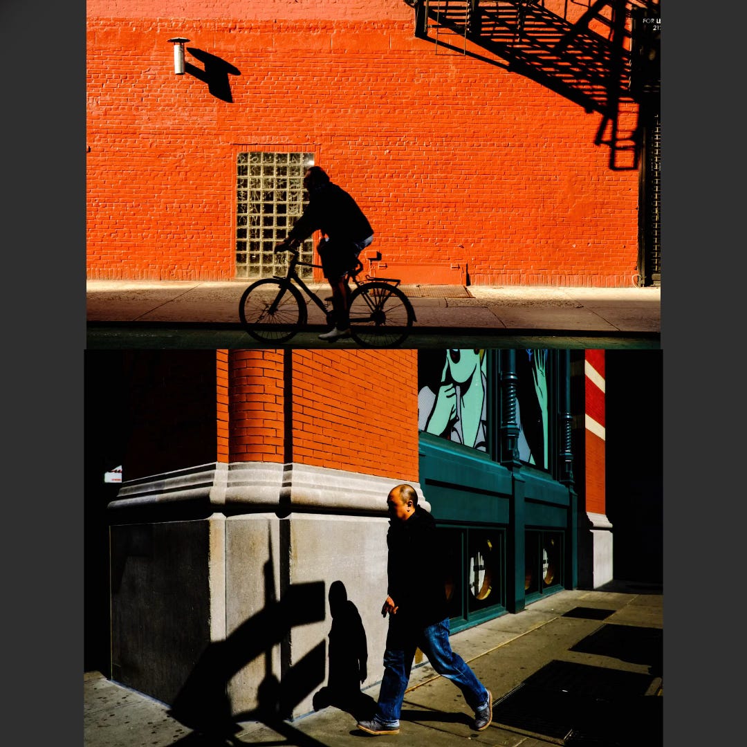
I often see photos that I think are a good composition that would look better in black and white. Just because there’s pink, red or orange doesn’t make for a good photo. This is one of the reasons that I shoot in monochrome. Loud colors jump out at you and demand your attention. Seeing it in monochrome helps me to see both exposure and composition.
When you eliminate the distractions it becomes a little easier to see if it’s any good. For at least the last year I’ve been shooting both raw and jpg and using film simulation recipes. The beauty of also shooting the jpgs is that what you see is what you get for your jpgs. It’s merely what you can achieve with processing for your raw files. All the photos in this newsletter are the jpgs with minor tweaks.
When it comes to the actual photos, I often find that monochrome is somehow more poetic. It leaves room for the viewer to interpret the photo. Whether it’s shooting or viewing photos, color can distract from the actual image.
It’s also possible that when I look at the photos of favorite photogs, monochrome always jumps out at me. It strips down an image to its bare elements. I say that while seriously considering buying the new Winogrand Color book. Oh, I do appreciate color photography by others.
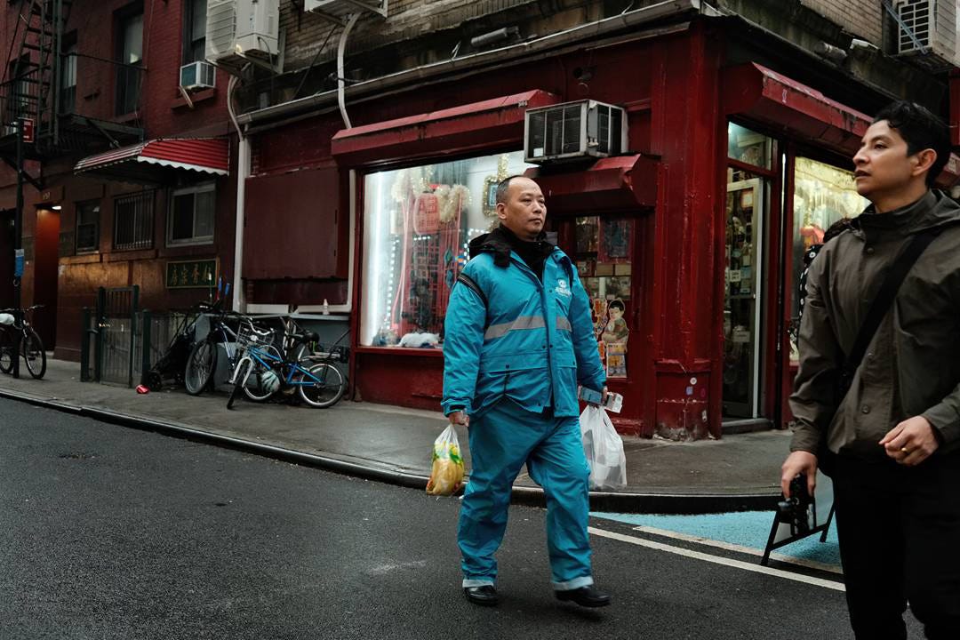
So I’ve decided to spend some more time looking at color photos and working on processing in color. Just to provide you with a very recent image processed, below you will see the same image as above in color. The beauty of shooting both in raw and jpg is also a problem as I have doubles of all my photos!

Okay, I guess it isn’t terrible in color. Do you try out both color and black and white? Do you prefer one or the other? I made adjustments to the raw file without changing much other than white balance, contrast and haze. It was taken in afternoon light.
The beauty of photography is that we have easy access to the tools to process our photos. Unlike the days when it was only film and an incredible process to get a good looking print even with a good negative.
As always, I look forward to your comments and suggestions. I’d love to hear about how you feel about the difference between monochrome and color. It is of course a very personal experience in how we see photography.
City in Color - Photozine
I have a few copies left of my photozine City in Color. I took all of the photos during a 6 month period in 2018, They are signed and numbered limited to 100 copies. They ship internationally as well. You can see more info about it and order it on my website.

Biweekly Photo Assignment - Shadows
What is photography without shadows & light? When there’s sun I’m shooting shadows. Yes, be creative. All kinds of shadows are good.
This is a voluntary assignment if you want to take part. You can submit your photos to the Facebook group for Shoot New York City and also on Instagram tag @shootnewyorkcity.
Further Viewing
If you are feeling a little uninspired shooting at the moment, Alex has some good advice.
Upcoming Workshops
Workshops are a maximum of 5 people Workshops are only scheduled on weekend days. If you would like to have a weekday workshop or a workshop in other areas of NYC, let me know with some lead time and I’ll see if others want to also attend it. Otherwise I continue to provide private workshops on weekdays and in other neighborhoods.
For those who haven't done a workshop or photo tour with me in the past I have a number of reviews on my website and also on TripAdvisor! Workshops are both for people who live here and also travelers, as are photo tours.
Photo tours are one-on-one and arranged on an individual basis for both neighborhood and photographic style and can be designed as a workshop as well. They are customized to your interests and level.
A fine newsletter. You are right. We are fortunate now to easily achieve prints of the same image in both monochrome and color, and to be able to edit so easily compared to what we did in the past.
Great newsletter Leanne - I feel the same re: Monochrome vs Colour - I think it's way harder to post-process colour - there seems to be this need to have a colour 'style' or 'look' ... I find it so much easier in mono where I feel the only real thing is the tonality ...